
Wolt Menu Redesign
A visual redesign for Wolt’s main menu categories, focused on improving clarity, engagement, and overall user experience through playful illustrations and stronger visual hierarchy.
Project Type
UX/UI | App Experience | Visual Design

The Challenge
The original category visuals felt inconsistent, visually crowded, and harder to recognize quickly while browsing the app.
The Solution
The menu categories were redesigned using cleaner compositions, brighter color palettes, and custom 3D-inspired illustrations to create a more engaging and easier-to-scan experience.
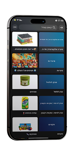
Before
Generic visuals with inconsistent styles and lower visual hierarchy.
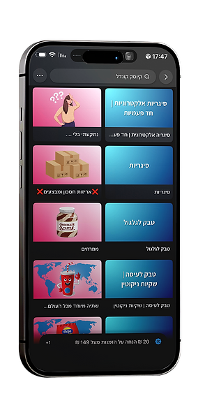

After
A cohesive illustration system designed to improve recognition,
navigation, and product visibility.
Custom-designed category visuals created to improve navigation, recognition, and engagement within the Wolt browsing experience.





DESIGN PROCESS

Research
Analyzed the original menu experience to identify visual inconsistencies, weak hierarchy, and opportunities for stronger user engagement.

Concept
Created a playful and cohesive visual direction designed to improve recognition, navigation, and category distinction within the app.

Design
Developed a custom illustration system using brighter colors, cleaner compositions, and modern 3D-inspired visuals to create a more engaging browsing experience.

Results
The redesigned categories created a clearer and more visually appealing interface, contributing to increased engagement and higher sales across multiple categories.
VISUAL STRATEGY

Brighter Colors
Designed to attract attention and improve category recognition.

Consistent Illustration Style
A unified visual language across all categories for a cleaner browsing experience.

Appetite Appeal
Playful and visually engaging imagery designed to encourage interaction and clicks.
